Before embarking on the design and development of your e-learning course, it is useful to create a design system to create consistency in your design.
Here are some important questions to think about for your course design:
Photos or illustrations? Realistic or conceptual?
What type of fonts? Thick or thin?
What type of colors? Bright or dark?
Today, I’m going to focus on an easy way to create a color palette for your course using 2 free tools – Flat UI Colors and Coolors.
Let’s go!
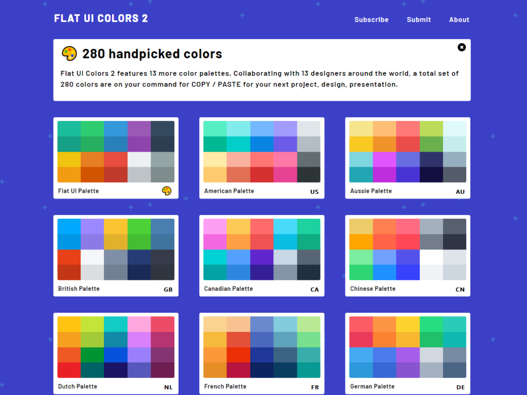
Flat UI Colors is a website with 14 palettes created by designers around the world. Each palette contains colors that work well in 2D designs.
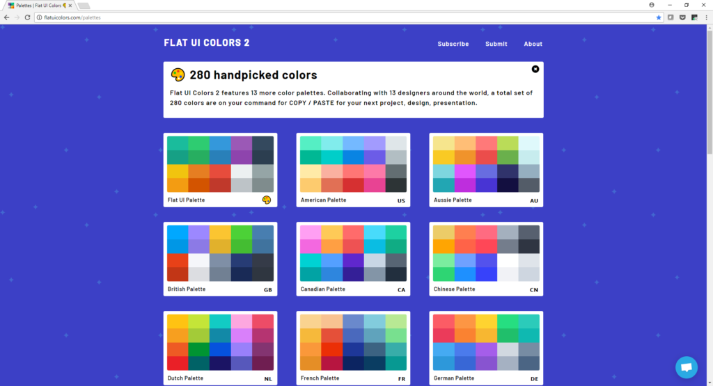
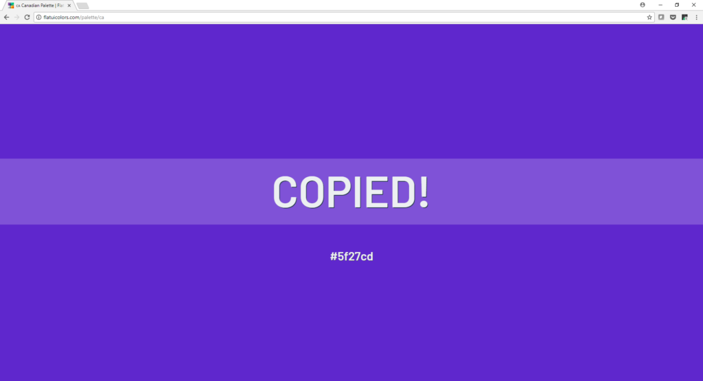
After clicking on a palette, you can click on the color you like. This copies the 6-digit hex code.

I selected this beautiful shade of blue-violet from the Canadian palette, and copied the hex code #5F27CD. This will be my main color for the course.
Then, I go to Coolors to select other complimentary colors to complete my palette.

Click the blue button, and you’ll be presented with 5 random colors. You can click on the hex code and replace it with our color #5F27CD.
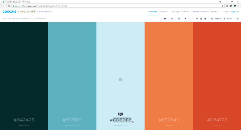
You can see that our blue-violet color shows up. It has a name – Iris! Click on the lock icon 🔒 to lock this color in place.
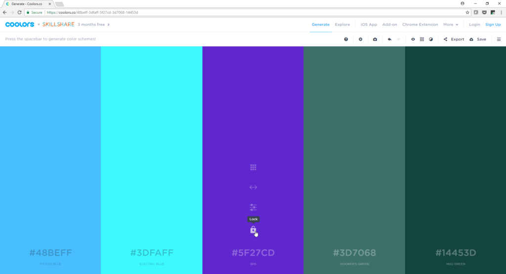
Then, press the spacebar to generate 4 other colors that work well with Iris! Keep clicking spacebar until you find something you like. If you like 1 color but not the others, lock that color and continue searching!
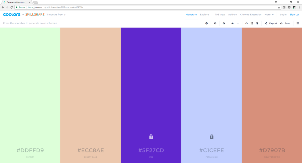
After a few clicks, I found a palette that I liked.
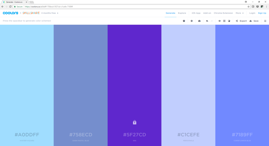
Save these colors as a custom color palette on your authoring tool, and you’re good to go! (On Storyline, it is Design > Colors > Create New Theme Colors) After you do so, everything you insert (text, text boxes, buttons etc.) will automatically be in those colors and it’ll save you a lot of time! 😊
Keep playing with it until you find something you like! It takes a few extra minutes, but being mindful and strategic about your design is sooooo worth it, trust me. Cheers!

